Shop Sign progress part 1
As I was preparing to teach my upcoming carving class, I realized I didn’t have a sign. Â So, I thought I’d warm up my carving muscles for my class and demo, and make a sign for Badger Woodworks at the same time.
I started with some the Alder I’ve posted about before which I’m running a little low on, and glued three sections together to make a larger panel. Â I used Hide Glue and a bunch of clamps, and it worked like a charm. Â The wood has some funky grain in a few spots, but otherwise seems carve-able.
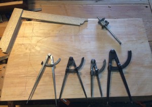
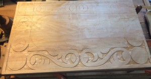
For this layout I started with a border around the edge, and set circles in the corners. I played around with proportions until I got something where I could put two S scrolls along the bottom, and a single one up the sides. Â Putting the roundel or circle in the corner made it easier to layout, and gives me lots of options for designs. Â I tried to do some strapwork based on the circles on a previous design and nearly drove myself mad trying to make it work with the proportions so I skipped that this time.
Since I knew I was going to put my shop name in the middle, I sub-divided my remaining space and used the center line to create two half circles at the ends to bound the middle space. I’ve seen a bunch of corner/triangular space filling designs in other chests and I thought this might be a good place to experiment with those.
With the layout basically done, I started setting the scroll work, and relieving the background. Â I knew I had the carving demo coming up so I deliberately didn’t finish the outside edge so I could use it for examples in my demo. Â I experimented with a half button inside the loops, but I’m still not sure the design element works here.
For the text I went to my trusty word processor, picked a good font and started playing with layout. Â Once I felt I had something good, I started printing out samples and laying them on the wood. Â It took four tries to find the right spacing and layout. Â Once I had that I taped it down with blue tape, and went over the outlines with a pen directly on the paper pressing down HARD to make a dent in the wood below. Â This left a nice impression that I was able to follow later to make the letters.
I knew that “Woodworks would be much longer than “Badger” so I had to fill in some space as well. Â I tried free handing the design but I’m not sure it works as well as I was hoping, something I will need to practice some more.
To outline the letters I set in outline with 3 different chisels, a small medium curve gouge, a slight larger gentle curved gouge, and a straight/flat chisel. Â I was able to do almost every single curve with these two gouges. Â I had to be very careful on the thinner legs of the letters and already chipped one out which I had to glue the wood back in. Â Then it’s just a matter of relieving the outside, and texture punching the background.
More to come later as I finish the project.
One Comment
Comments are Disabled


[…] See previous post here: Part 1 […]